Brand guidelines
Storytelling
LFP Media has developed a new visual identity for Ligue 1 McDonald's. These brand guidelines aims to ensure visual consistency and aesthetic harmony in all brand communications, strengthening its image and fostering an emotional connection with its audience.

Origin of the symbol
The One, a new symbol, iconises the ‘Insatiable’ image of the championship. It is built around a strong and simple symbol made up of an L and a 1, which are used as a signature.It represents the diversity of French football and plays on its many facets by playing on a chameleon principle.
It can then respect the competition colors but also be adapted to club colors.
By animating the icon, you can create powerful, impactful variations from different angles.
There is the equivalent symbol for Ligue 2 BKT with ‘The Two’, made up of an L and a 2.
World Feed Graphics
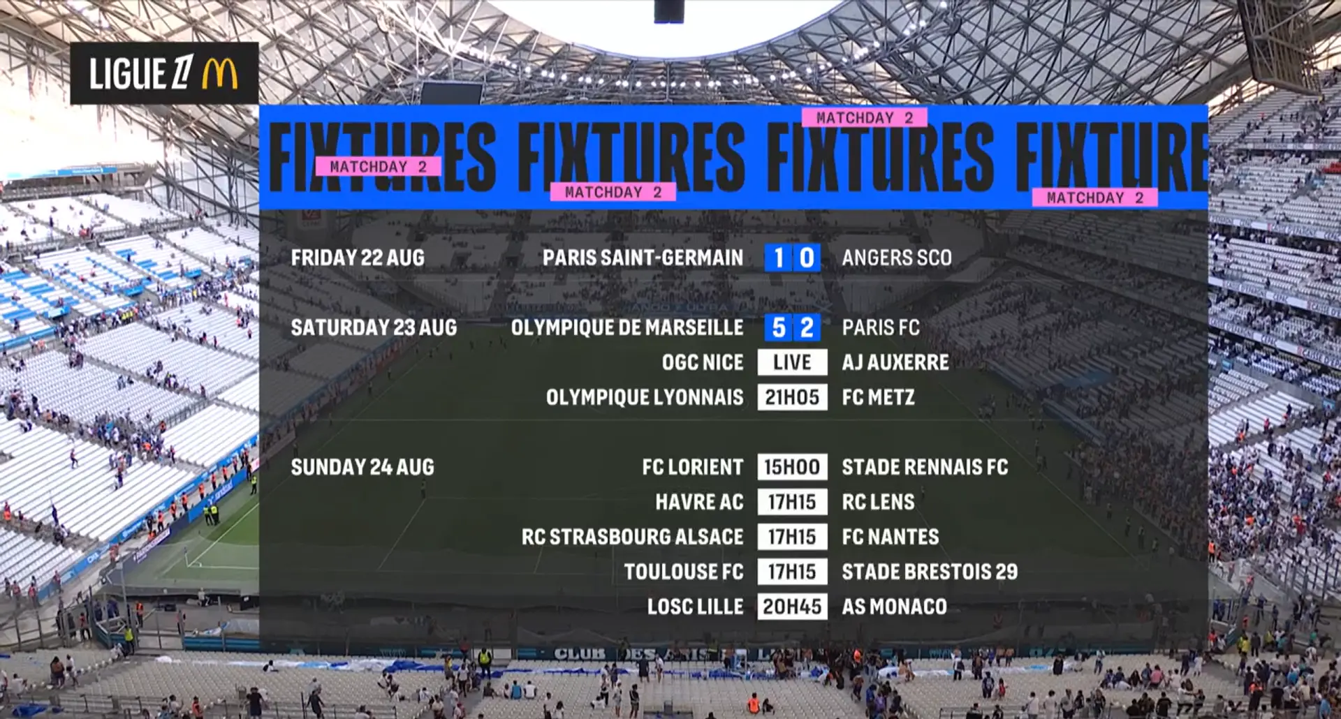
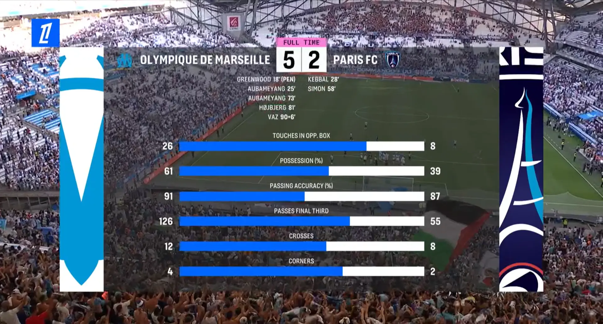
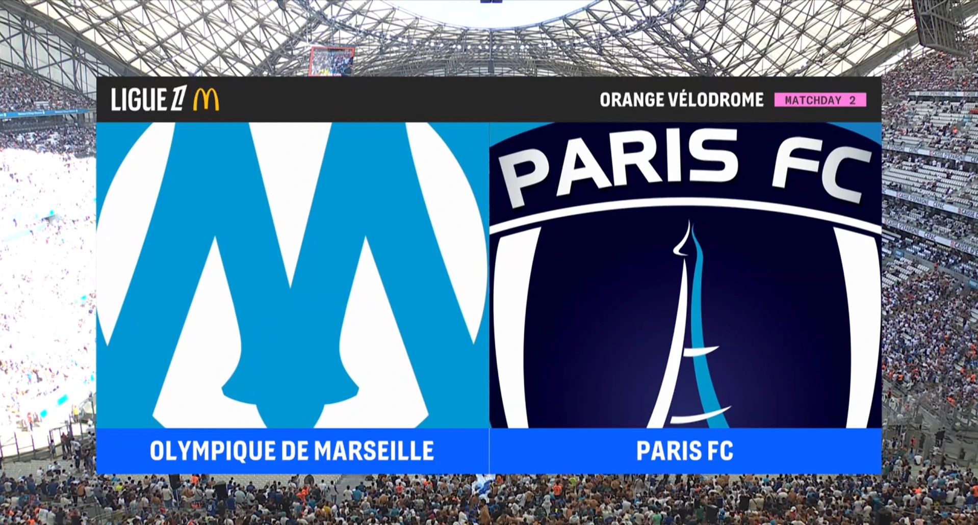
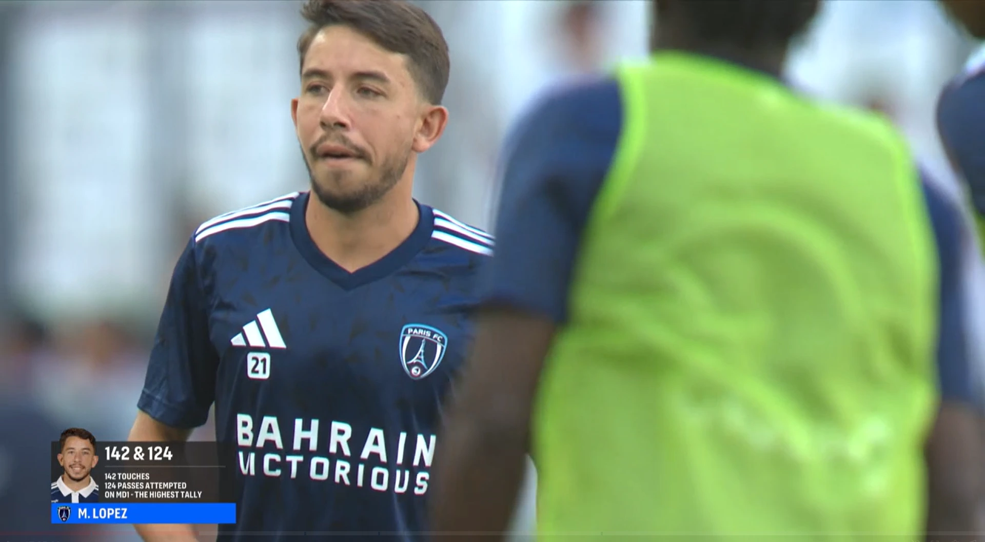
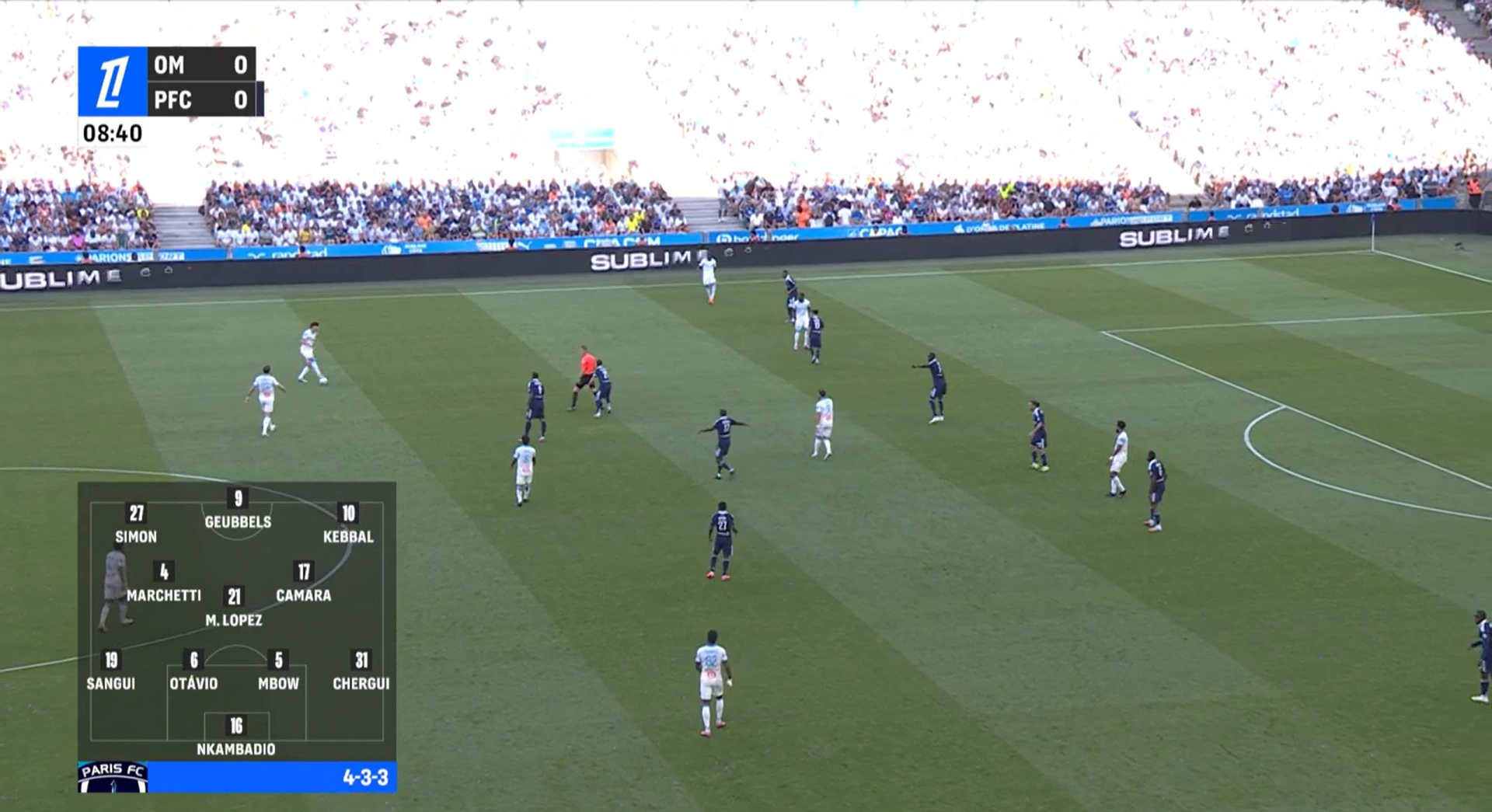
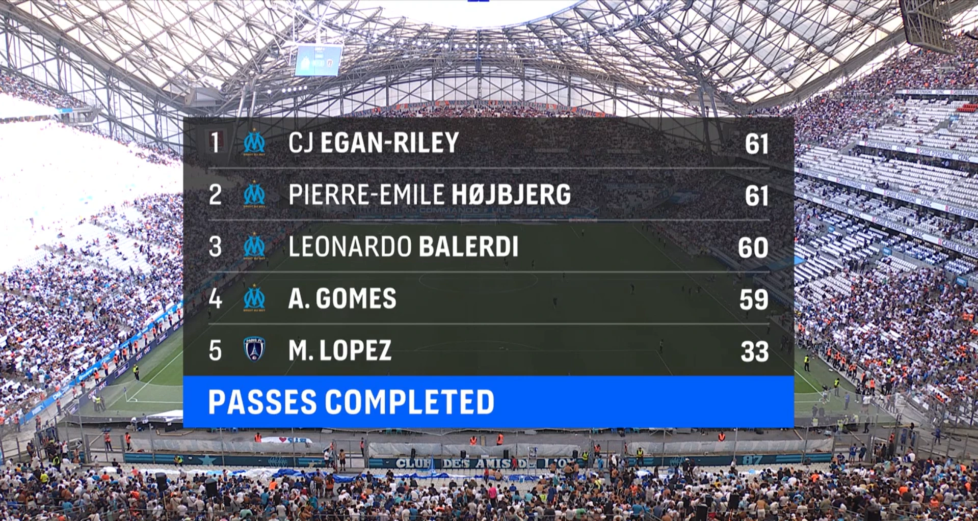
Brand new on-screen graphics have been designed to reflect the Ligue 1 McDonald's brand identity, based on the competition logo below. The logo is the cornerstone of the Ligue 1 McDonald’s visual identity. Compliance with the graphic elements and proportions will ensure that the competition’s visual signature is clear, instantly recognizable and easy to remember. LFP Media works with Leroy Tremblot (TV Graphics) and Gédéon (opening title) to provide Ligue 1 McDonald’s on-screen graphics services to the Host Broadcasters and other broadcasters.
Opening/Closing Sequences
The World Feed Running Order includes the official McDonald’s opening and closing sequences for all its matches. There are two versions:
- A long version of 30 seconds
- A short version of 12 seconds
Football.but.french
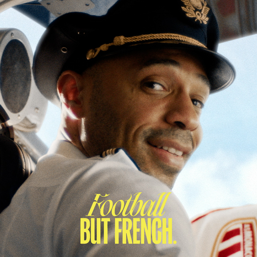
Ligue 1 has set an ambitious goal to transform from a domestic league into a globally recognized brand rooted in France’s cultural heritage. To address this, the league aims to reshape its identity through a three-part strategy: improving its image, enhancing the fan experience, and integrating football into youth culture.
This new era focuses on repositioning Ligue 1 as a symbol of French excellence, inspired by leagues that have successfully evolved into global spectacles. The transformation also includes modernizing its visual identity, launching digital platforms, and collaborating with cultural figures. Ultimately, Ligue 1 seeks to engage a broader audience, turning football into a central part of French life and elevating the league's stature internationally. This rebranding will benefit players, clubs, partners, and fans, making French football a force of global influence and cultural pride.
TV Graphics
Private graphics
International Broadcasters must use Ligue 1 McDonald's visual graphics to produce all additional graphic elements they wish to add to their match coverage or their programs dedicated to Ligue 1 McDonald's, such as, for example, identifying their commentators or studio guests. All the individual elements of Ligue 1 McDonald's brand guidelines are available on the Ligue 1 Broadcast Hub. All additional graphic elements that International Broadcasters wish to use in their own programming must receive prior approval from LFP Media.
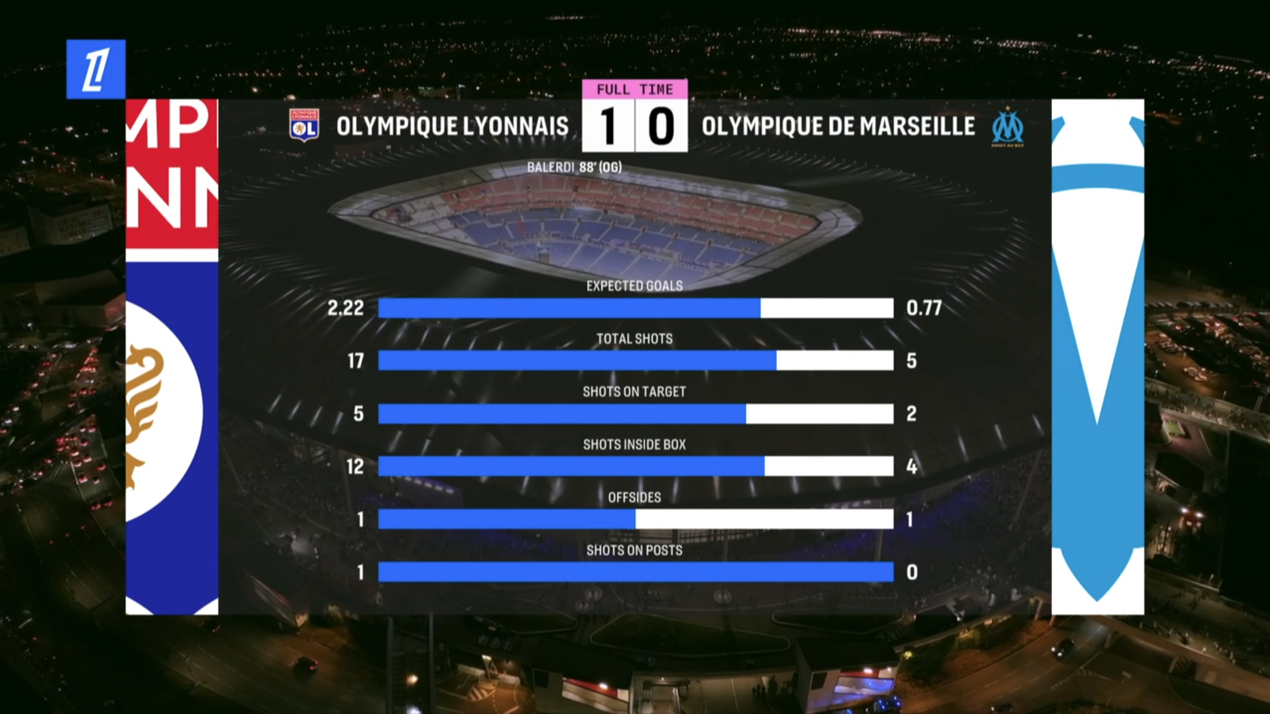
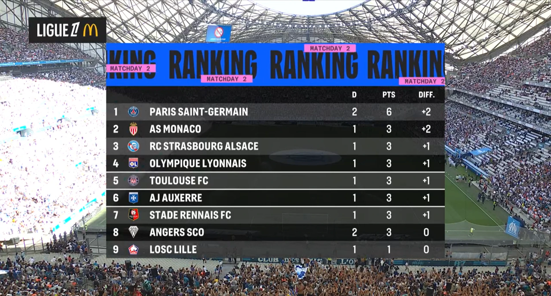
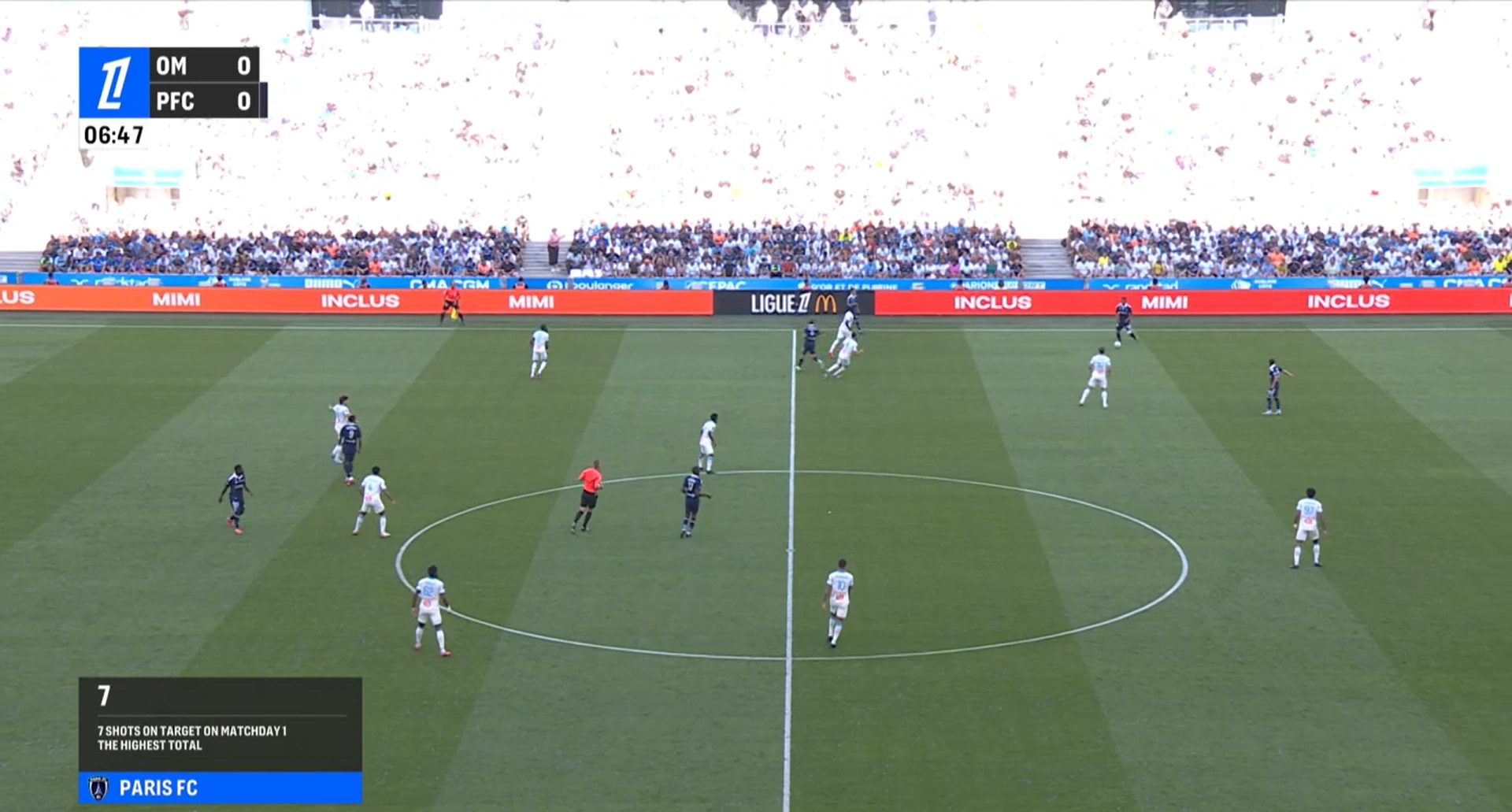
Official data
LFP Media produces official statistics for the competition. To produce these statistics, LFP Media chose the STATS PERFORM company as provider of official Ligue 1 McDonald's statistics. The World Feed integrates these statistics into its broadcast via the following principles (see World Feed Running Order):
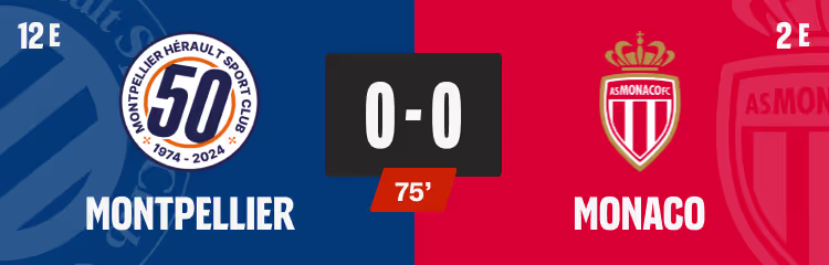
• During the 1st and 2nd halves: regular displays of statistics of teams and players separately;
• At half-time and full-time: full statistics including team statistics.
Digital overlay
LFP Media and its clubs integrate digital overlay sponsors on the perimeter boards for a selection of matches during the season. LFP Media will rely on its international broadcasters to make sure they use the proper feed including digital overlay targeting their respective markets.
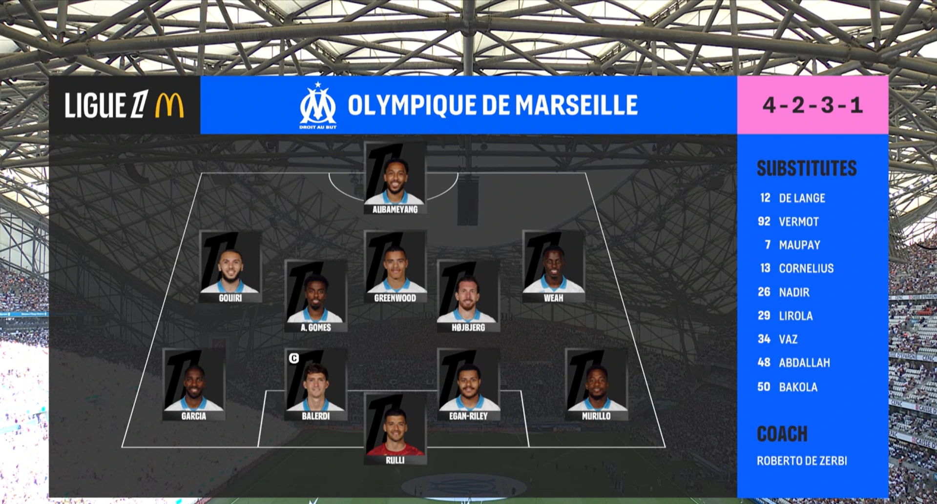
Graphic charter
Clubs are commercial entities and the club name, as a rule, is different to the name of the city in which they play. The club name should be used rather than the name of the city. In accordance with Ligue 1 McDonald's brand guidelines, the clubs have validated the use of two names:
- A ‘short’ name (maximum 11 characters) for use in the match score clock, ensuring the television viewers understand the club name.
- A ‘long’ name for all other On Air graphic elements
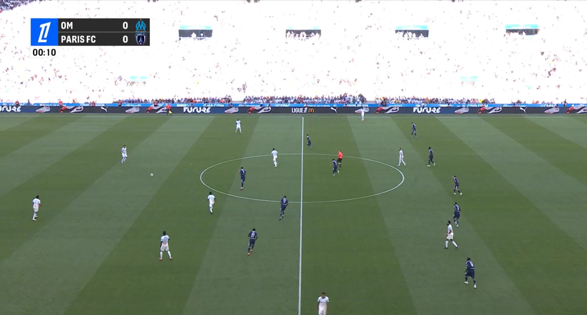
Clock & score
Short name
Long name
MAIN COLORS
Colors of typefaces
White on coal
White on Electric bluE
Electric bluE on coal
coal on Electric bluE
Coal on bright pink
Main fonts
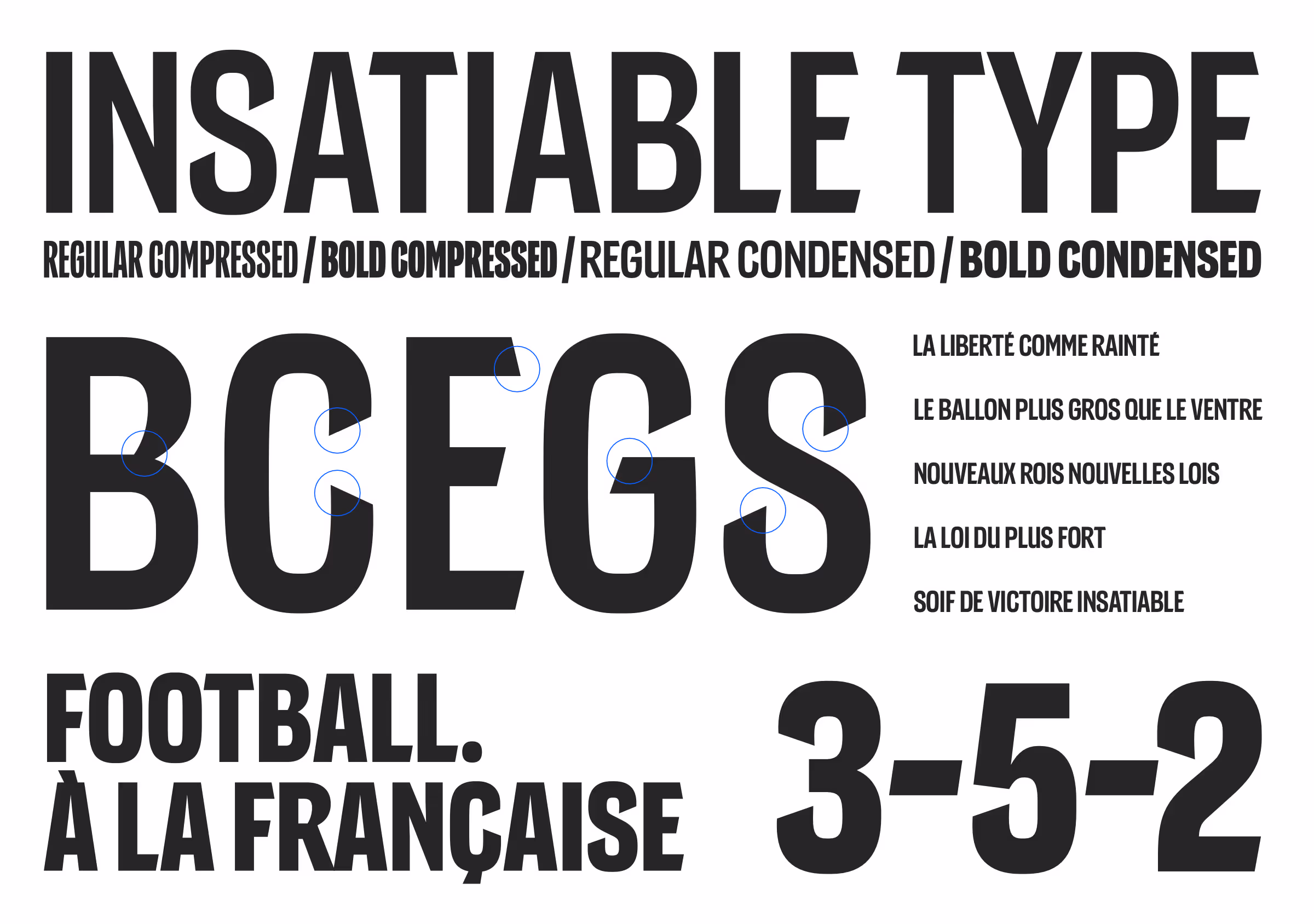
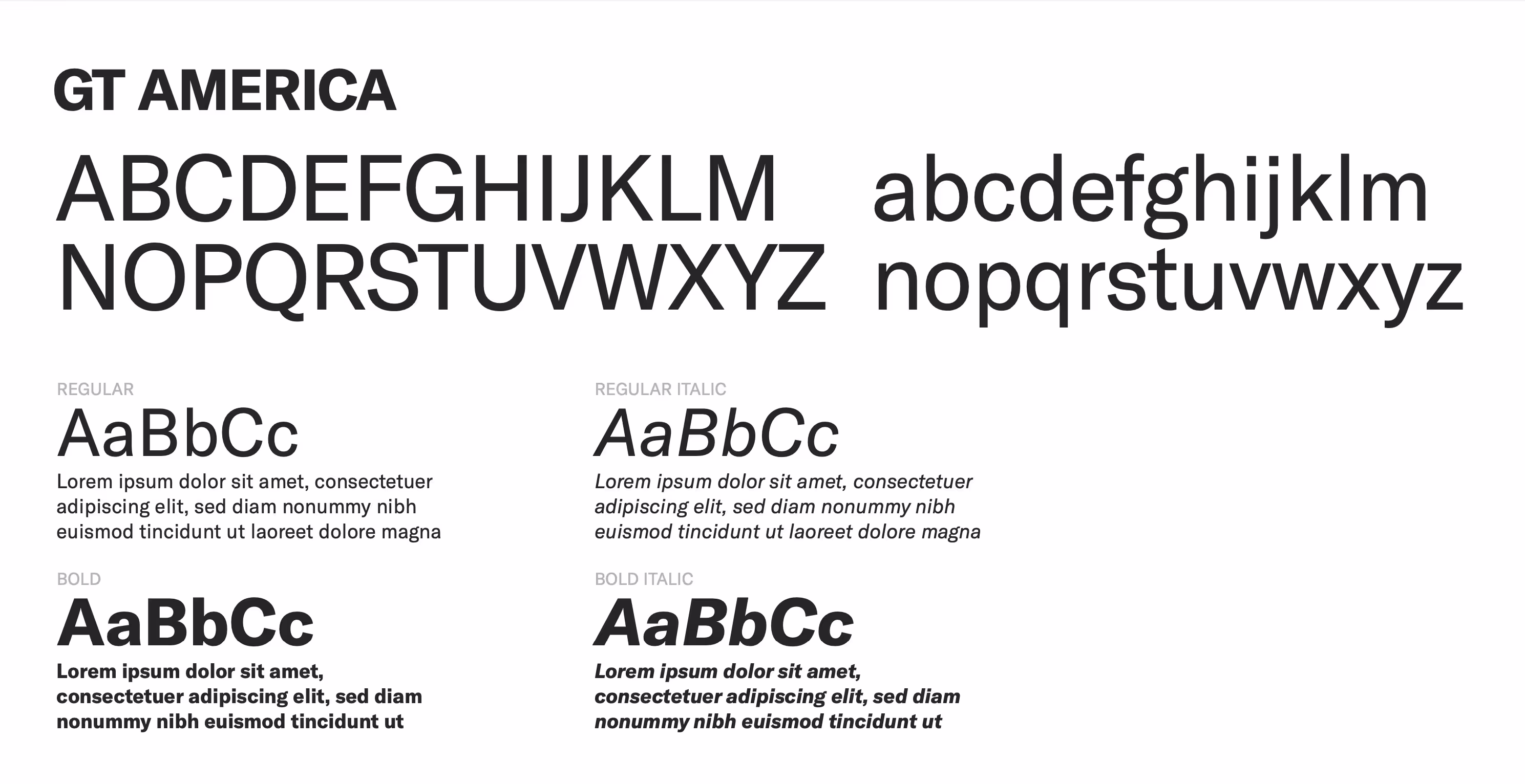
GT america
This second typography is used for body text. It is a versatile font that works well in small sizes with optimal legibility. In body text, we use GT America Standard in styles: Regular, Regular Italic, old, Bold Italic for everyday text. For technical elements such as data and supplementary information, especially our highlighted blocks, we use the Mono style of GT America.
Examples